
Problem: How might we re-design the Apple iOS App Store Connection Error Screen?
Solution: It even happens to Apple: error screens. Even if a user is connected to the internet, sometimes the iOS App Store 'search' comes up with an error screen. This happened to me recently and thought it could be improved so as to offer an opportunity to showcase other app store assets to the user.
Inspired by the Apple Mac storefront, I redesigned the error screen so we keep all the functionality of the current screen. All of the original wayfinding functionality remains the same: Users can still tap 'Retry' to re-connect to the search results, tap on the search icon on the menu bar, or be redirected to any other part of the store via the menu bar.
Where Apple uses an all grey layout, not event calling attention to the RETRY button, My solution adds the blue CTA button highlight text to call attention to: RETRY & GET. It serves up other options as well from the top three categories in the App Store: APPS, GAMES & TODAY sections, displayed in a carousel pattern, using a swipe left interaction to see the featured apps. In this way, this screen can be customized to serve different users (which may lead to more downloads of the featured brand (A/B testing could support this)) or be hard coded in the App Store app and Apple could use this space to showcase different products, partnerships, or advertisements.

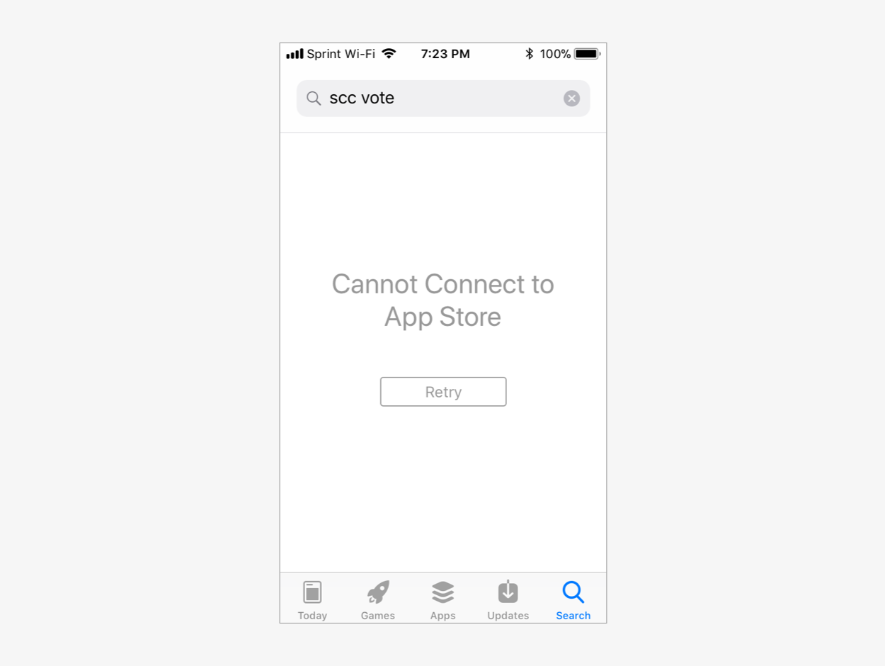
(L-R): After: My App Store Error Connection Screen Solution; Before: Current App Store Error Connection Screen.
I'm always open to friendly emails!
adangerdesigner(at)gmail.com