The High Museum, the leading art museum in the Southeast. From 2010-2015 they’ve seen a decline of about 20 percent, representing over 100,000 visitors annually.
Our team used a user centered approach to create new features for their iOS app: ArtClix.
My role: UX Research, UX Design, Usability Testing, Visual Design Lead & Interaction Design Lead. Determine how to increase the usage of their app and attendance. (Based on a fictional brief)

● 4 person design team
● Daily scrum stand-ups
● Bi-weekly stakeholder buy-ins
Research
(What is the industry? What experience does the app already provide?)
Define
(Users, Find patterns, Define the opportunities)
Decide
(How might we, Validate the problem)
Ideate & lo-fi prototype
(Deep everyone in the loop, To prevent big surprises)
Iterate & test
(User test where possible)
Create wireframe prototype & test
Hi-fi interactive prototype (tested)
Results
The museum’s app, ArtClix, had not been updated since it’s launch in 2015 and was only usable at the museum for limited artwork.
Through a heuristic evaluation I determined the app had no dedicated homescreen, it lacked the ability to take audio tours, check on upcoming events or purchase tickets.
The High Museum wanted to expand their app by adding self-guided tours, photo and information galleries and adding events happening at The High Museum.

Our solution focused on a high impact tour feature helping to attract a broader audience and lead to increased attendance. Additionally, we added a dedicated homescreen where users could see upcoming events, purchase tickets and plan their visit.


Who are the High Museum users? What factors do they consider when taking a tour? What type of content do users look for in a museum app? How are they using technology at the museum? What are the business goals for the museum?

Problem: How do you perform research and observations of a remote clients platform and users?
Answer: Conduct a 'remote' ethnographic field study in a comparable environment.
I went into the field and conducted observational research on museum tours using San Francisco's MOMA as a comparable equivalent for the High Museum. I also conducted field interviews with museum employees and museum patrons.


I was responsible for conducting online surveys. We received a total of 46 respondents. I wanted to know factors patrons considered when deciding to take a tour, preferred device type, information and content needed/accessed and common app/online museum features are used.


We looked at other museums of a similar level, looking for industry standard features that today’s museum patrons have come to expect and industry best practices. We looked at: SFMOMA, Guggenheim, The Metropolitan Museum of Art, and SF De Young Museum.

I interviewed museum members and casual visitors in-depth. This helped build empathy with museum patrons. What shapes their behavior when deciding to visit a museum? What does a typical visit for them look and feel like?

Synthesizing our survey metrics and using affinity mapping, I began to see clear patterns in our ‘fuzzy data’:
● 95.6% of respondents either have or wanted to take a museum tour and prefer exploring at their own pace
● 73.9% of users only use iOS devices
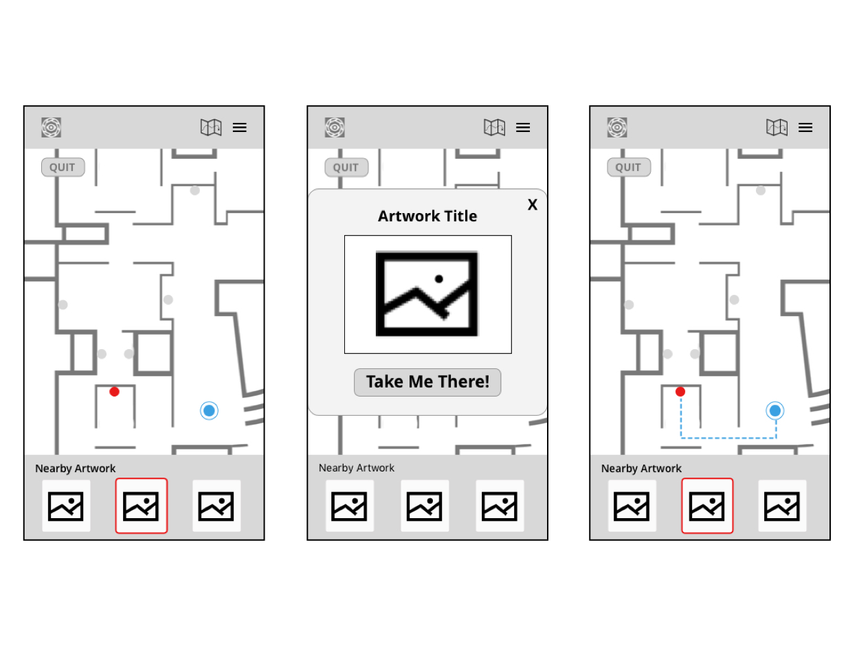
● Audio tours allow you to go at your own pace and get all of the information museum patrons need
● Patrons like to refer back to artworks they saw after they’ve left the museum
● Information respondents valued the most were: historical context of artwork, artist biography, and images

I observed that our users fell into two categories: Active & Casual Learners, these users love traditional audio tours, yet our primary users, like Dora our persona, was a 'Casual Learner' who wants smaller brief bits of information as they wander within the museum on their own. They're often not already museum members, an untapped audience, the exact type of patron the High Museum would like to attract more of.


How might we help the High Museum attract a broader audience and create a deeper connection with residents of the greater Atlanta area?
Our solution was to focus on casual patrons. Visitors who may not have considered a museum membership and would value a high impact tour feature and museum information via ArtClix. Features that are currently unavailable in the pre-existing experience.
To achieve this goal, we created a user journey for Dora, our persona, and an updated site map so we could easily see how our new features would eventually fit in to the existing experience. We updated these artifacts as our testing with users validated our features.


With our Persona and User Flow, we used the Design Studio method and Dot Voting to quickly iterate our first sketches. This rapid iteration allowed us to quickly settle upon our first wireframes for a Minimum Viable Product to test.


Our low-fidelity sketches were used as paper prototypes to begin user testing.
We found some valuable insights: there were unnecessary screens, terminology in the app that was confusing, the information hierarchy, and placement of primary features were unclear at times. All of this helped us iterate for a second stage paper prototype and more testing.


Using the updated user test findings, I used Sketch to create a refined interactive prototype.
We gave our users pre-determined tasks to accomplish based on a user scenario of: navigating the homescreen options, selecting an audio tour, finding the artwork within the museum, and getting information on a piece of artwork.
After making some adjustments, we decided to move onto the next level of fidelity.


I took the lead creating the high-fidelity prototype in InVision using Sketch to produce the designs and assets.
I referred to the High Museum brand guidelines to make sure that our new features would fit into their branding guidelines to keep a visual consistency.
Our final rounds of testing were very successful, users said that this felt like a useful app they would be able to rely on to broaden their museum experience.


Through the use of competitor and user research, personas and user journeys, I was able to include valuable solutions based on feedback.
These solutions included:
● Adding Audio Tours
● Improved Global Navigation
● Addition of Museum Maps
● Saving Seen Artworks (past visits)
● Adding Home Screen Links for: Artwork Search, Event Information, Museum Information, Donations, Membership Information
These added features would help broaden the High Museum audience, raise attendance numbers allowing users to plan a visit, purchase tickets, and stay informed about upcoming events.
I'm always open to friendly emails!
alex(at)dangerousdesigner.com