I led the UX, Research, UI and Front-End Development, working with Inclusive America, a non-profit government startup building diversity for the White House Presidential Personnel Office, I built a total digital identity that included a brand mark, style guide, presentation assets and responsive website that established their online presence, enabling investors to understand their value proposition, attracting funding and early adopters.

Final Assets: Inclusive America Brandmark, Responsive Website & Presentation Deck (not pictured).
● Solo work
● Applied a design method to align design with current trends
● Communicated with stakeholders to gather feedback and buy-in
Research User Experience
(What is the current user experience? What is the company overview and mission? What is the industry? What is the existing brand mark? What message do they want to convey?)
Decide
(How Might We…define the messaging?)
Inspiration
(users, stakeholders, find symbols, define ideas)
Ideation
(Symbol, Color, Typography, Brandmark)
Stakeholder feedback & iteration
(keep everyone in the loop & work towards a solution)
Presentation deck
Responsive website
High fidelity assets, handover & launch
Results
Inclusive America was unsatisfied with their brand identity. They asked for a solution that felt uniquely American, friendly but firm, that would help them feel confident pitching their disruptive platform to financiers and secure early stage seed funding.

Old Inclusive America Branding Materials
I developed a successful core brand and user experience for a project with a tight timeline and limited resources. I conducted internal and external industry analysis, stakeholder interviews, and focused on the top keywords to guide my direction.

Research: Core Brand Attributes
I analyzed Inclusive America's digital presence and considered the perspective of their target audience (potential investors and candidates) to understand their perception.

I analyzed the competition in the political engagement space and found that Inclusive America was competing with other upstart organizations and the government resource, The Plum Book, a resource for jobs in Washington D.C.. I evaluated their messaging to gain insights into their approach.

U.S. Government 'Plum Book'

Upstart civic engagement startup in the government space
Key findings included:
● The target demographics are candidates that trend younger, focusing on women and people of color.
● Brand attributes must feel Inclusive & Diverse.
● The website must be brief, informational yet convenient enough for investors who are time poor and candidates who ask to be included.
● Stakeholders made it clear that I should steer away from traditional colors of ‘Red or Blue’ that you would typically see in political materials, yet wanted to find a way to honor symbols of inclusion while maintaining a clean, modern and bi-partisan feeling.

Melissa, User Persona

Inspirational Mood Board
Inclusive America was unsatisfied with their brand identity and assets.
How might we create a uniquely American brand identity for Inclusive America so that it helps attract investors and candidates to become part of a political disruption?
My core design values included:
Inclusive & Diverse: Create an identity that represents many diverse pieces coming together.
Disruptive & American: Typography and logo design should represent the vacant appointments that Inclusive America is looking to disrupt.
Awareness ribbons are used to convey social action, a convenient way for people of diverse backgrounds to call attention to a cause.Sketching hands holding hands or people reaching out to help 'pull' each other up, eventually combined and became a 'Ribbon' that mimicked hands.
Using Sketch, I applied the golden ratio and constructed a single ribbon that 'folded' onto itself.

Trusty sketch book

Applying the golden ratio
The Typeface
‘Inclusive America’ is stacked with America as a Bold foundation to complement a ‘thin’ ‘Inclusive’ both weights mimicking inequality.

Typography
The Brand Color
Purple had a dual benefit of traditionally being used to represent the fight for equal rights and as a reference to The Plum Book.

Research: Finding the brand color
The Brandmark
The finished logo represents many diverse pieces coming together, Use of negative space was critical to the final logo. The ribbons do not touch in the formed star, a separate but cohesive group that represents ‘America’ filling vacant opportunities represented by the negative space.

Brandmark v1.0 Style Guide
Problem: What do you do, when your client, ‘dislikes’ your design?
Answer: Demonstrate that they have been heard and build consensus.
I accommodated suggestions in new designs and iterated my own work with stakeholder feedback showing stakeholders that I hear them and build consensus towards a direction.

Feedback suggestion sheet made it easy for stakeholders to 'see' what they asked for and easy to pick out the direction they wanted to explore using the column and row names.
At the end of the day, we decided to use a modified version of my treatment of the Star Logo.

My goal was to build a responsive, one page website with simple sections that were informational and concise.
Using Sketch, I created a desktop wireframe using @media queries of 900 px with a 12 column grid, a logo that doubled as a home button and smooth scroll navigation tabs that navigates the user to the corresponding section.
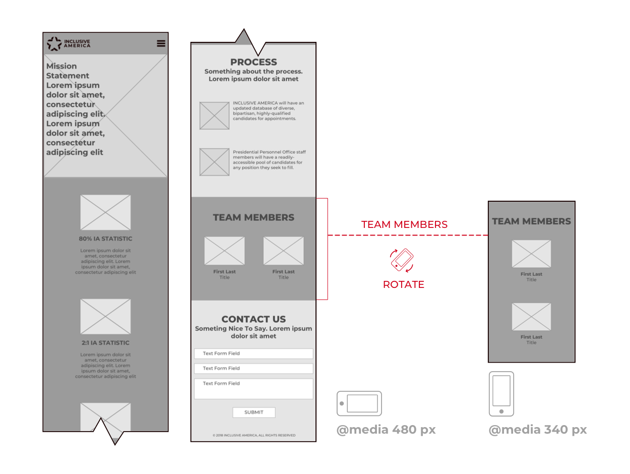
For mobile (Landscape) I used @media of 480 px with a two column grid. Mobile (Portrait) was designed using @media of 340 px.
I secured stakeholder feedback using a high fidelity prototype using HTML, CSS, Java Script with Webflow to develop the prototype and responsive site. Upon approval, we secured hosting and launched the site.

Website sketches
Mobile Redline

Site Assets
The goal was to build a deck using Google Slides that could be customized to fit any condition the Stakeholders needed. Simple enough to change quickly but stylized enough to look and feel branded.
There were specific requirements for the deck: Pre Deck with Logo, Title Slide with contact info, Text content, text slide with percentages content, pull quotes, phase roll out slides, budget, team members, Q & A, and contact slides.
Icons were selected from existing assets found on Noun Project, images were found using royalty free searches and all assets were customized to fit the brand.

The total delivered assets included: Brandmark, Style Guide, Presentation Deck with Assets, High Fidelity Prototype & Live Responsive Website.
The brand identity assets and site have been used in venture capital pitch meetings and for adding members to the Inclusive America team. Mark and Jana continue to make progress with their dream of increasing diversity in government.

Inclusive America Website Demonstration

Inclusive America Final Brandmark
Inclusive America Responsive Website

Inclusive America Desktop Website

Inclusive America Presentation Deck
I'm always open to friendly emails!
adangerdesigner(at)gmail.com